Visualization settings (analytics tab)
Use the  analytics tab to display value lines and data guides in chart visualizations.
Depending on the visualization type, the following sections can be available:
- Average – Show an average line in a visualization.
- Median – Show a median line in a visualization.
- Min – Show a line at the minimum value of the data displayed in a visualization.
- Max – Show a line at the maximum value of the data displayed in a visualization.
- Last – Show a line at the last value of the data displayed in a visualization.
- Percentile – Show a percentile line in a visualization.
- Constant – Show a line at a specified value in a visualization.
- Data guides – Show a quadrant for the Bubble, Scatterplot, and Scatterplot Heatmap visualizations.
For each section, define the settings for the line and its label in the following fields. Certain fields are available only for specific sections.
Note: Enter a value in a field, and then press Enter. The visualization is immediately updated with the settings.
| Item | Use this item to |
|---|---|
|
Show average line |
Display the average line in a visualization. This field is specific to the Average section. |
|
Show median line |
Display the median line in a visualization. This field is specific to the Median section. |
|
Show minimum line |
Display a line at the minimum value of the data displayed in a visualization. This field is specific to the Min section. |
|
Show maximum line |
Display a line at the maximum value of the data displayed in a visualization. This field is specific to the Max section. |
|
Show last value line |
Display a line at the last value of the data displayed in a visualization. This field is specific to the Last section. |
|
Show percentile line |
Display the percentile line in a visualization. This field is specific to the Percentile section. |
|
Show constant line |
Display a line at a specified value in a visualization. This field is specific to the Constant section. |
|
Show quadrant |
Split the plot area into quadrants. The quadrants are based on the median values of each axis. This option is available for the Bubble, Scatterplot, and Scatterplot Heatmap visualizations. |
|
Name |
Specify a name for the line. |
|
Value |
|
|
Line color |
Define the color of the line. |
|
Line thickness |
Define the thickness of the line. |
|
Line dash length |
Define the length of the dashes on the line. |
|
Line position |
Define the position of the line. You can choose to show the line in front of or behind the chart elements. |
|
Label |
Specify whether to display a label for the line and define its content. You have the following options:
|
|
Label position |
Define the position for the label of the line. You can choose to show the label to the right or to the left of the line. |
|
Font color |
Define the font color for the label of the line. |
|
Font size |
Define the font size for the label of the line. |
|
Show fill above |
Display a fill color above the line. |
|
Fill above color |
Define the color to fill the area above the line. |
|
Show fill below |
Display a color below the line. |
|
Fill below color |
Define the color to fill the area below the line. |
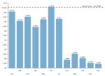
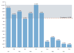
The following examples show you how each of the value lines is represented in a visualization.
You defined the following settings for the average line.
| Setting | Value |
|---|---|
| Name | Average |
| Line color |

|
| Line thickness | 3 |
| Line dash length | 7 |
| Line position | Behind |
| Label | Name and value |
| Label position | Right |
| Font color |

|
| Font size | 15 |
| Show fill above | No |
| Fill above color | None |
| Show fill below | Yes |
| Fill below color |

|
The visualization looks as follows.
You defined the following settings for the median line.
| Setting | Value |
|---|---|
| Name | Median |
| Line color |

|
| Line thickness | 3 |
| Line dash length | 7 |
| Line position | Behind |
| Label | Name and value |
| Label position | Right |
| Font color |

|
| Font size | 15 |
| Show fill above | Yes |
| Fill above color |

|
| Show fill below | No |
| Fill below color | None |
The visualization looks as follows.
You defined the following settings for the minimum line.
| Setting | Value |
|---|---|
| Name | Minimum |
| Line color |

|
| Line thickness | 3 |
| Line dash length | 7 |
| Line position | In front |
| Label | Name and value |
| Label position | Left |
| Font color |

|
| Font size | 15 |
| Show fill above | No |
| Fill above color | None |
| Show fill below | Yes |
| Fill below color |

|
The visualization looks as follows.
You defined the following settings for the maximum line.
| Setting | Value |
|---|---|
| Name | Maximum |
| Line color |

|
| Line thickness | 3 |
| Line dash length | 10 |
| Line position | In front |
| Label | Name and value |
| Label position | Right |
| Font color |

|
| Font size | 15 |
| Show fill above | No |
| Fill above color | None |
| Show fill below | No |
| Fill below color | None |
The visualization looks as follows.
You defined the following settings for the last value line.
| Setting | Value |
|---|---|
| Name | Last value |
| Line color |

|
| Line thickness | 3 |
| Line dash length | 10 |
| Line position | In front |
| Label | Name and value |
| Label position | Left |
| Font color |

|
| Font size | 15 |
| Show fill above | No |
| Fill above color | None |
| Show fill below | No |
| Fill below color | None |
The visualization looks as follows.
You defined the following settings for the percentile line.
| Setting | Value |
|---|---|
| Name | Percentile |
| Value | 70 |
| Line color |

|
| Line thickness | 3 |
| Line dash length | 10 |
| Line position | In front |
| Label | Name and value |
| Label position | Right |
| Font color |

|
| Font size | 15 |
| Show fill above | No |
| Fill above color | None |
| Show fill below | No |
| Fill below color | None |
The visualization looks as follows.
You defined the following settings for the constant line.
| Setting | Value |
|---|---|
| Name | Sales Goal |
| Value | 8500000 |
| Line color |

|
| Line thickness | 3 |
| Line dash length | 10 |
| Line position | Behind |
| Label | Name and value |
| Label position | Right |
| Font color |

|
| Font size | 15 |
| Show fill above | Yes |
| Fill above color |

|
| Show fill below | No |
| Fill below color | None |
The visualization looks as follows.
You can use value lines for the following visualization types:
- Bar and column charts (except box plots)
- Line charts
- Area charts (except heatmap area)


