Meter gauge
|
|
|---|
|
Meter gauge |
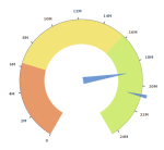
A meter gauge chart uses needles to show information as a reading on a dial. The needles for actual and target values are read against the chart axis and/or colored qualitative data ranges such as poor, average, and good.
A meter gauge consists of the following elements:
- Main needle – A needle to show the value of interest (actual gross sales).
- Secondary needle – A needle for the value against which you compare the primary measure (planned gross sales value, last year’s sales).
- Colored regions – The qualitative ranges generated based on the measures that are defined in the corresponding data fields (range 1, range 2, and range 3). The name and color for each range can be customized.
When to use
Gauges are useful in storyboards visualizing KPI (Key Performance Indicators) when evaluating one measure and comparing it against another related measure.
A meter gauge can be used for the following business use cases:
- Compare sales to the sales forecast.
- Compare KPIs like revenue, expenses, new customers, defects, and others.
The two measures compared should share the same scale and unit of measurement. Note that the comparative value is usually the point that the measure should reach or exceed, such as a sales target. However, when you evaluate an expense target, it functions as a point that the measure should stay below.
Data requirements
To build this chart, define the data fields as follows:
- Actual – One measure that represents a value of interest.
- Target – (Optional) One measure that represents a comparative value.
- Tooltip – (Optional) One or more measures.
-
Range 1 – (Optional) One measure that represents the first range (for example, poor performance).
-
Range 2 – (Optional) One measure that represents the middle range (for example, average performance).
-
Range 3 – (Optional) One measure that represents the last range (for example, good performance).
Use case
The following gauge chart shows the total actual gross sales versus planned gross sales. Also, the measure can be evaluated against three qualitative ranges, such as poor, average, and excellent.
If your dataset does not have columns to define ranges, you can create calculations to reflect your ranges. For example, you can define ranges by dividing the target value into three parts as follows:
- The bottom third: (Planned Gross Sales/3)
- The middle third of data: (Planned Gross Sales/3)*2
- The top third: (Planned Gross Sales)+(Planned Gross Sales)*0.1
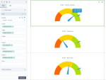
The following gauge charts evaluate profit against data ranges. Each chart is filtered for the state of interest by using the dataset filter on the visualization level. The range colors are customized, and the value axis is hidden. By pointing to the needle, you can view the information on values.
You can easily customize the gauge dial position and the distance for starting and ending colored range bar, relative to the center (radius). The following chart uses the 7 am to 5 pm position, where the value axis radius coincides with the range end radius.
References
For details on how to customize your visualization, see Visualization settings.
For a whole list of visualizations, see the following topics:
- Visualizations by function (find a visualization to suit your business case)
- Visualizations by type (find a visualization based on how it is organized on the interface)


