Path map
|
|
|---|
|
Path map |
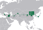
With the path map, you can show how numeric data is changing geographically over time or following a specific sequence. The location points are plotted on a map and connected with lines. You can plot multiple routes on the same map for comparison and analysis. Each location point is represented by a marker. When you point to the marker, corresponding data values are displayed in a tooltip.
When to use
You can use a path map when you want to show:
- The transportation routes based on the time sequence (bus lines with their stops and the number of passengers at each stop)
- The quantitative data for individual locations that compose the path (goods movement and gross sales at each location of the path)
Data requirements
To build this chart, define the data fields as follows:
-
Path name – One dimension to define a unique ID for each path. For example, a bus line name, metro line, route ID. The path name defines the grouping, how to connect the points.
-
Path location – One location dimension (names or coordinates for each data point in a path).
Consider the following when adding a location dimension:
- Names: To create markers for cities, you can drag a dimension called City, for example. Add multiple dimensions, for example, Country and City, to improve geocoding results for the datasets containing cities with the same names but in different countries. For example, if you have Paris in France and Paris in the USA, they will be plotted appropriately.
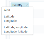
- Coordinates: If you have columns with coordinates, drag them, and then click to apply their geographical role. Including coordinates results in faster performance and adds more flexibility in defining marks.
Depending on what you want to visualize, you can choose the appropriate map (a specific country, for example) on
 appearance tab.
 -
Path sequence – One dimension that defines how to connect the points. This can be a date, date/time information, or manually applied numbers, such as 1, 2, 3, 4, 5.
-
Color – (Optional) One dimension by which to color the data. For example, you can color by path name or route ID so that each route has its own color.
-
Marker size – (Optional) One measure column to define the size of the markers (location points) that are part of a path.
-
Marker – (Optional) One dimension column that contains links to SVG images for each location dimension.
This can be helpful if you want to use a specific image for each location. For example, you can have a column with flags corresponding to each country. Thus, a map will plot the flags for the countries as a marker. The images can be animated SVGs if you need to add interactivity to a visualization.
- Tooltip – (Optional) One or more measures.
-
Location tooltip – (Optional) One dimension that you want to use as a tooltip for the dimension in the Path location field.
This can be useful if you want to override dimension tooltips from the Path location field. This may apply when you have coordinates of places and want to use other names as a tooltip instead of latitude and longitude details.
Use case
You want to visualize how the goods are delivered and what the sales are at each point on the way to the final destination. The marker size indicates the amount of gross sales. You can view the details for each location point in a tooltip.
References
For details on how to customize your visualization, see Visualization settings.
For a whole list of visualizations, see the following topics:
- Visualizations by function (find a visualization to suit your business case)
- Visualizations by type (find a visualization based on how it is organized on the interface)


