Filled map
|
|
|---|
|
Filled map |
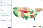
With a filled map visualization, you can show regions (divided geographical areas) on a map based on the location dimension (such as country or state). The regions are colored or shaded according to the range of values for a measure. For example, if you select a sequential palette, the regions are tinted from light (lower values) to dark (larger values). You can add other measures to display in the tooltips for each region.
When to use
Filled (choropleth) maps are great for intuitively presenting the geographical distribution of your data. The data can be misinterpreted if the size of a region overshadows its color because large areas attract attention while small regions are left unnoticed. In this case, you can also use a hex map where all regions of the map are represented equally by hexagons, which eliminates the bias related to different area sizes.
Data requirements
To build this chart, define the data fields as follows:
-
Location – One or multiple geographical dimensions.
Depending on what regions you want to visualize, you can choose the appropriate map (a specific country, for example) on
 appearance tab.
 - Color – (Optional) One measure.
- Tooltip – (Optional) One or more measures.
Use case
The following chart shows the gross sales for each state in the USA where the company sells goods. By pointing to a state, you can view the values of the gross sales in each one, and additional information is shown in a tooltip (the number of customers, in this example).
You can change the colors for the map background, the type of markers and their relative size, and perform many other customizations. These options are available on the  appearance tab of the visualization settings pane.
Here is another example using the United States (hex) map, where each of the US states is represented by a hexagon.
References
For details on how to customize your visualization, see Visualization settings.
For a whole list of visualizations, see the following topics:
- Visualizations by function (find a visualization to suit your business case)
- Visualizations by type (find a visualization based on how it is organized on the interface)


