Filter
|
|
|---|
|
Filter |

With filter widgets, you can control which data is displayed in the visualizations on a storyboard page. By applying the filters, you reduce the amount of data that you need to analyze. This helps you focus only on the data of your interest.
When to use
Use a filter widget to reduce the amount of data that you want to display in your visualizations. For example, if a visualization presents your company's sales per month, you can apply a filter to view only the sales for a specific product line.
You can use the following filter types:
-
Dropdown – Select one value or all the values from the dropdown list. The drop-down list shows the records from the column that is used for filtering.

This filter type is available if you select a column that contains dimensions.
-
Single select – Select one option from the list. The list shows the records from the column that is used for filtering.

This filter type is available if you select a column that contains dimensions.
-
Multi select – Select several values from the list. The list shows the records from the column that is used for filtering.

This filter type is available if you select a column that contains dimensions.
-
Expression – Enter a mathematical expression that you want to use for filtering the data in a non-aggregated status. For example, if you use the Sales Cost column for filtering and enter the expression >100, the filtered visualization shows only the data items for which the sales cost is higher than 100.

You can use the following symbols.
Symbol Use this item to = Show only the data items whose value is equal to the specified value. For example, use "=100" to show only the data whose value is equal to 100.
> Show only the data items whose value is greater than the specified value. For example, use ">100" to show only the data whose value is greater than 100.
>= Show only the data items whose value is greater than or equal to the specified value. For example, use ">=100" to show only the data whose value is greater than or equal to 100.
< Show only the data items whose value is less than the specified value. For example, use "<100" to show only the data whose value is less than 100. <= Show only the data items whose value is less than or equal to the specified value. For example, use "<=100" to show only the data whose value is less than or equal to 100.
><
<>
Show a range of numeric values. For example, use ">100<500" to show only the data whose value is more than 100 and less than 500, or "<500>100" to show only the data whose value is less than 500 and more than 100.
>= <=
<= >=
Show a range of numeric values. For example, use ">=100<=500" to show only the data whose value is greater than or equal to 100 and less than or equal to 500, or "<=500>=100" to show only the data whose value is less than or equal to 500 and greater than or equal to 100. This filter type is available if you select a column that contains measures.


You can apply filters to the following visualization types.


For details on adding filters, see Add filter widgets.
Use case
View the following examples for using filter widgets.
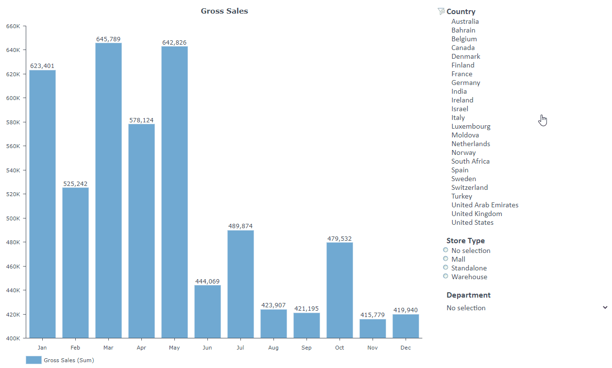
You created a visualization that displays your company’s total gross sales per month. You want to show the trend of gross sales only for specific countries.
To do so, add a filter widget to the storyboard and configure it as a multiselection filter. After you configure the filter, in the multiselection list, click the countries for which you want to show the trend. The visualization will display the trend only for the selected countries.

You can add several filters to a filter widget, but every filter must have a unique combination between the Dataset and the Column.
You created a visualization that displays your company's total gross sales per month. You want to filter the results based on the country, department, and store type.
To do so, add a filter widget to the storyboard and create the following filters:
- A multiselection filter for the country column. After you configure the filter, in the multiselection list, click the countries for which you want to show the gross sales. The visualization will display gross sales only for the selected countries.
- A dropdown filter for the department column. After you configure the filter, in the dropdown list, select the department for which you want to show the gross sales. The visualization will display gross sales only for the selected department.
- A single-selection filter for the store type column. After you configure the filter, in the single-selection list, select the store type for which you want to show the gross sales. The visualization will display gross sales only for the selected store type.
You can apply the same filters to multiple visualizations if the visualizations are based on the same dataset.
You want to present a sales overview for your company. You created three visualizations that share the same dataset, for example, the gross sales per product type, the gross sales per store type per month, and the gross sales and discounts per month. You want to filter specific data on all three visualizations at the same time.
To do so, add a filter widget to the storyboard and create the following filters:
- A dropdown filter for the country column. Add all three visualizations to the targeted widget list.
- A single-selection filter for the store type column. Add all three visualizations to the targeted widget list.
- A multiselection filter for the department column. Add all three visualizations to the targeted widget list.
After you configure the filter widget, on the storyboard, you can perform the following actions:
- In the dropdown list filter, select the country for which you want to show the sales overview. All three visualizations will display the data only for the selected country.
- In the single-selection filter, select the store type for which you want to show the sales overview. All three visualizations will display the data only for the selected store type.
- In the multiselection filter, select one or more departments for which you want to show the sales overview. All three visualizations will display the data only for the selected departments.
Tip: Depending on your needs, you can choose to have multiple filter widgets instead of one filter widget with several filters on a storyboard.
References
For details on how to customize your widget, see Visualization settings (appearance tab).
For a whole list of visualizations, see the following topics:
- Visualizations by function (find a visualization to suit your business case)
- Visualizations by type (find a visualization based on how it is organized on the interface)