Box plot chart
|
|
|---|
|
Bar box plot chart |

|
|
|---|
|
Column box plot chart |

A box plot chart shows patterns of numerical data by splitting a statistical set of data into quartiles. The box plot represents a five-number summary: the minimum, first (lower) quartile, median, third (upper) quartile, and a maximum of a set of data.
You can use a column box plot chart, which is the vertical representation of the data, or a bar box plot chart, which is the horizontal representation of the data.
The following table lists the main elements of the box plot.
| Image | Item | Explanation |
|---|---|---|
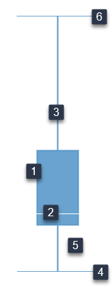
|
 Box Box |
Represents the part of your data points that are around some central value (an “average” of data). It covers the 25th and 50th percentiles of the data. |
 Median Median |
The line that cuts through the box into two pieces. If one side of the box is longer than the other, it does not mean this side contains more data. Each section of the box plot contains 25% of the data. If one of the sections is longer than another, it indicates a wider range in the values of data in that section (meaning the data are more spread out). A smaller section of the box plot indicates the data are more condensed (closer together). |
|
 Whiskers Whiskers |
The lines that extend from either side of the box to the smallest and largest data points: the minimums and maximums outside the first and third quartiles. These data points indicate variability outside the upper and lower quartiles. | |
 Minimum Minimum |
The least value. | |
 Quartile Quartile |
The first (lower) quartile group of data, which begins with the minimum data point. |
|
 Maximum Maximum |
The greatest value. |
When to use
A box plot chart is used to analyze how the statistical data is distributed. A box plot can show whether a set of data is symmetric (roughly the same on each side when cut through the middle) or skewed (lopsided).
Data requirements
To build this chart, define the data fields as follows:
- Dimension – One dimension
- Measure – One measure
Use case
The following box plot chart (column box plot chart) shows the summary information for the gross sales for a number of countries.

You can also use the bar box plot chart: the x and y axes are swapped, and you can view a horizontal representation of the data. The bar box plot chart is especially useful when you have long labels for the dimensions.

References
For details on how to customize your visualization, see Visualization settings.
For a whole list of visualizations, see the following topics:
- Visualizations by function (find a visualization to suit your business case)
- Visualizations by type (find a visualization based on how it is organized on the interface)