100% stacked bar (column) chart
|
|
|---|
|
100% stacked bar chart |
|
|
|---|
|
100% stacked column chart |
A 100% stacked bar (column) chart compares two or more measures across one or two dimensions. The sum of all the measures represents 100% of a dimension. This chart type displays bars or columns composed of segments. The segments represent the measures as percentages. Each measure is represented by a different color. The measures that you select need to show composition; therefore, they should be comparable and share the same scale and units of measurement.
In the bar charts, the measures are placed one after the other, from left to right. The width of each segment represents the measure's percentage related to the whole.
In the column charts, the measures are placed on top of each other. The height of each segment represents the measure's percentage related to the whole.
This chart type is best used to highlight the contribution percentage of each measure to a dimension, when the cumulative total is not important.
When to use
The 100% stacked bar (column) chart can be used to illustrate the contribution percentage of each of the following measures to 100% of a dimension:
- Sales and marketing costs, travel expenses, and entertainment costs – to the operating cost for each department.
- Building rent, insurance costs, subscriptions, and utilities – to the administrative expenses for each city.
- Operating and non-operating costs – to the total costs for each line of business and country.
The 100% stacked charts are useful when the sum of the values is not important. Instead, the value resides in showing the trend for each measure across the dimension values, or for the measures within a specific dimension value.
A good rule is to use a maximum of three or four measures; otherwise, the chart can become hard to read.
A bar chart displays data as horizontal bars, while a column chart displays data as vertical bars. However, the data is processed the same way.
The following table shows the main differences between the two chart types.
| Use column charts to | Use bar charts to |
|---|---|
|
|
Data requirements
To build this chart, define the data fields as follows:
- Dimension – One or two dimensions
- Measure – Two or more measures
- Tooltip – (Optional) One or more measures
- Trellis – (Optional) One dimension
Use case
View the following use cases for the 100% stacked chart, based on the chart orientation.
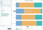
The following chart shows the composition of the operating cost per department. The cost types are represented by different colors.
This chart emphasizes the contribution percentage of each cost type to the total operating cost for every department. The individual values of the cost types are not important here.
In this case, the bar chart is preferred to the column chart because the dimension is not related to time, and it has data with long labels.
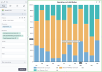
The following chart shows the composition of the operating cost per month. The cost types are represented by different colors.
This chart emphasizes the contribution percentage of each cost type to the total operating cost for every month. The individual values of the cost types are not important here.
In this case, the column chart is preferred because time values are better understood when they are graphically represented from left to right.
References
For details on how to customize your visualization, see Visualization settings.
For a whole list of visualizations, see the following topics:
- Visualizations by function (find a visualization to suit your business case)
- Visualizations by type (find a visualization based on how it is organized on the interface)


