Butterfly chart
|
|
|---|
|
Butterfly bar chart |
|
|
|---|
|
Butterfly column chart |
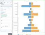
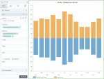
A butterfly bar (column) chart represents two data series side by side with the scales meeting at the center. In other words, the chart is comprised of two bar or column charts on either side of the same value axis. With this chart, you can see how one series compares to the other series for a given data point. The measures should be comparable and share the same scale and units of measurement.
When to use
Use the butterfly bar (column) chart to compare two opposing measures, such as male and female, positive and negative opinions, and similar data series. Both data series are plotted as positive values. In general, you may use it as an alternative to a regular bar chart or a stacked bar chart whenever you present two data sets.
A bar chart displays data as horizontal bars, while a column chart displays data as vertical bars. However, the data is processed the same way.
The following table shows the main differences between the two chart types.
| Use column charts to | Use bar charts to |
|---|---|
|
|
Data requirements
To build this chart, define the data fields as follows:
- Dimension – One or two dimensions
- Measure – Two measures
- Tooltip – (Optional) One or more measures
- Trellis – (Optional) One dimension
- Color – (Optional) One dimension
Use case
View the following use cases for the butterfly chart, based on the chart orientation.
References
For details on how to customize your visualization, see Visualization settings.
For a whole list of visualizations, see the following topics:
- Visualizations by function (find a visualization to suit your business case)
- Visualizations by type (find a visualization based on how it is organized on the interface)


