Area heatmap chart
|
|
|---|
|
Area heatmap chart |
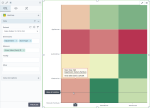
A heatmap chart shows color-coded data in a matrix. The two axes of the matrix represent dimensions from the dataset. In the matrix, the ranges of data values are represented by colors.
When to use
Use the heatmap chart to compare values (represented by colors) in a matrix or to get a general overview of the data pattern. For example, the body mass index chart is an example of a heatmap chart. In the chart, the range of values that corresponds to the normal weight (from a medical point of view) is colored in green, while the values that correspond to obesity are colored in red.
You can use the heatmap chart to analyze how customers rated the common features of a group of products. You can also compare the monthly sales of a group of products over a year and identify seasonal variations in sales.
Note: For this chart type, you need to set a rule for calculating the color range: by rank or by value. For details, see the Color range in the Palette and style section in Visualization settings (appearance tab).
Data requirements
To build this chart, define the data fields as follows:
- Dimensions – Two dimensions
- Measure – One measure
- Tooltip – (Optional) One or more measures
Use case
The following chart shows the gross sales per department and store type. The highest gross sales values are colored in green, and the lowest values are colored in red. The divergent palette was used for this chart type (heatmap). For details, see Color palettes.
In this chart, you can notice that the sales for the Home & Furniture department are the highest for the Standalone store type, while the sales for the Automotive department are the lowest for the Warehouse store type.
References
For details on how to customize your visualization, see Visualization settings.
For a whole list of visualizations, see the following topics:
- Visualizations by function (find a visualization to suit your business case)
- Visualizations by type (find a visualization based on how it is organized on the interface)

