Area chart
|
|
|---|
|
Area chart |
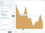
An area chart is used to analyze one or more measures across a dimension and to show trends. The area chart is similar to a line chart, but the area between the line segments and the x-axis is filled in with a color. The color filling highlights the magnitude of change over time or over another dimension.
When multiple measures are included, the first measure is plotted as a line with color fill followed by the second measure, and so on. If you want to represent several data series, a line chart can be a more legible choice. For details, see Line chart.
When to use
Use the area chart when you need an overview of the data and not exact values. For example, you can compare two related data series, such as gross and net sales over time.
Data requirements
To build this chart, define the data fields as follows:
- Dimension – One dimension
- Measure – One or more measures
- Tooltip – (Optional) One or more measures
- Trellis – (Optional) One dimension
- Color – (Optional) One dimension
Use case
The following chart shows profit versus planned profit by month.
The scope of this chart is to present the quantitative difference between the actual profit and the planned profit over a year. In this case, the overall trend is more important than the individual values of the two measures.
References
For details on how to customize your visualization, see Visualization settings.
For a whole list of visualizations, see the following topics:
- Visualizations by function (find a visualization to suit your business case)
- Visualizations by type (find a visualization based on how it is organized on the interface)

